The Quiet Boundary of Silent Interiors
Silence in an interior is not the absence of things. It is the moment when the eye stops being asked to account for everything at once.
A room may contain few objects and still feel restless. A pale wall can be too exposed. A shelf can be orderly and still too insistent. A light can be soft in colour but placed so visibly that it keeps pulling attention back to itself. Silent interiors are not made by reduction alone. They are made by deciding where attention should end.
This is a spatial decision before it is a decorative one. It concerns the edge of a lit plane, the distance between an object and the wall behind it, the amount of surface left unoccupied, and the point at which brightness gives way to shadow. The calmest rooms are rarely empty. They are edited with enough precision that each visible thing has permission to remain, and each surrounding interval has a task.
Silence begins at the edge of attention
Visual silence depends on boundaries. Not hard borders, but perceptible limits: a chair that does not crowd the wall, a low table that leaves air above it, a vertical element that relates to a corner without claiming the whole corner. When these limits are unclear, the eye continues to measure the room. It checks the height of the furniture, the brightness of the fittings, the surface of the wall, the object placed on the next surface. Nothing may be loud, yet everything keeps speaking.
A calm atmosphere begins when the room gives the eye fewer obligations. This does not mean hiding the source of every effect or suppressing character. It means that an object must have a reason for being seen at the scale at which it appears. A small object placed in a large empty area can become nervous. A large object in a narrow passage can make the passage feel negotiated rather than inhabited. The issue is not quantity. It is proportion under attention.
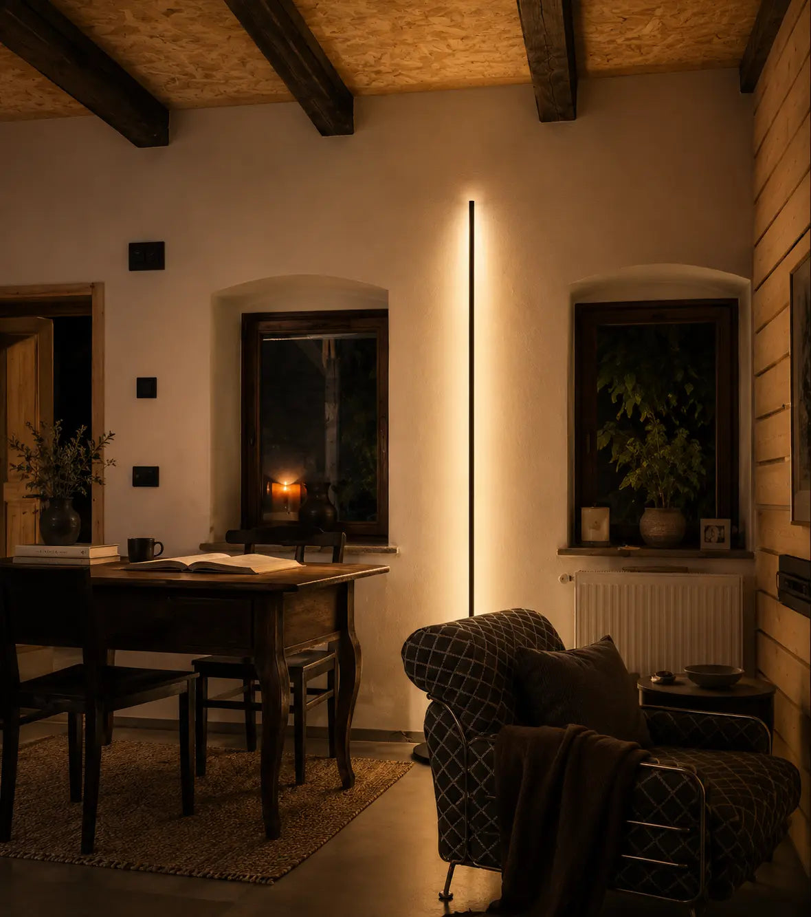
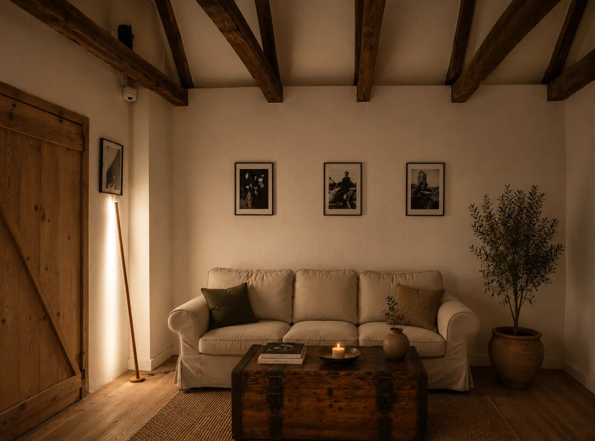
The wall is often the clearest test. A wall that is evenly bright from corner to corner can become flat and over-declared. A wall left entirely dark may withdraw too much, making the furniture in front of it feel unmoored. Between these conditions lies a more useful state: enough light to register the plane, enough shadow to let the plane recede. Quiet design often begins there, in the decision not to explain the whole surface.
A related reflection on the architectural role of lighting appears in When a Floor Lamp Becomes Part of the Architecture, where the object is considered through its relation to the room rather than as an isolated decorative item. The same discipline matters here, but with a narrower purpose: not to make the object belong to architecture in general, but to understand how little visual insistence is needed for an interior to feel complete.
The object that refuses to fill the room
In restrained interiors, the most important object is sometimes the one that does not try to occupy its full allowance of space. It may be tall, but narrow. It may be visible, but not bulky. It may introduce light without turning the source into the centre of the room. Such an object does not disappear. It simply avoids demanding the kind of attention that would unsettle the surrounding surfaces.
The Gica Contra Floor Lamp 150 is useful to consider for this reason. It is a sculptural object 1500 mm high, with a 20 × 20 mm sandblasted aluminium profile. Those dimensions matter here because they describe a particular kind of restraint: height without mass, a vertical presence with very little physical width. Its 2700 K light belongs to a warmer register, but the more important point is proportional. The object can be read clearly without filling the room with volume.
Its story is personal, drawn from an everyday dialogue between Tommaso Cristofaro and his son Riccardo, and the form takes its origin from an exclamation mark. That history should not be used to overburden the room with symbolism. In an interior, the more relevant lesson is how a strong sign can be reduced until it becomes measured enough to coexist with silence. The object retains a legible figure, yet the surrounding wall, floor and darker intervals are not forced into service as background spectacle.
This is where minimal lighting becomes a matter of judgment rather than style. A thin profile is not automatically quiet. A warm source does not automatically produce restful interiors. The surrounding relationships decide the effect: the height of nearby furniture, the width of the wall, the distance left around the base, the degree to which other objects compete for the same vertical field. Restraint is not contained in the object alone. It appears when the object and its space agree on how much attention is enough.
Shadow is part of the decision
Many interiors lose their silence through excessive correction. A corner seems dark, so another light is added. A wall feels bare, so it receives an object. A surface looks unoccupied, so it becomes a place for arrangement. These decisions often begin as acts of care, but they can remove the very pauses that allow the room to settle.
Shadow is not a failure of lighting. It is the condition that lets light remain legible. A softly lit surface requires an adjacent dimness in order to be perceived as deliberate. A narrow luminous form needs unclaimed space near it, otherwise its clarity is absorbed into visual clutter. The darker portion of a room is not merely what has been missed. It is part of the composition that prevents every plane from becoming equally active.
There is a practical consequence. When arranging a room for visual silence, the first action is not to add a quieter object. It is to remove unnecessary claims on attention. A floor area beside a wall may be left open. The top of a cabinet may remain empty. A corner may be allowed to hold shadow rather than another small furnishing. Only after these absences are accepted can a light object be placed with enough distance around it to have meaning.
This also explains why general rules about choosing or positioning a floor light can only go so far. Proportion must be judged within the actual room. For a broader discussion of scale and placement, the guide to choosing a sculptural floor lamp for a specific space is a useful continuation, but silence itself depends on a more selective question: which parts of the room should remain visually unoccupied after the lamp is present.
A room is finished when attention can rest
The feeling of a finished interior is often mistaken for completeness of content. Every zone has been furnished, every surface considered, every corner resolved. Yet a room can be complete before every possible place has been used. It can also be unfinished after every place has been filled.
The more reliable test is physical and immediate. On entering, the eye should be able to understand the main relations without being pulled into constant revision. The illuminated area should not cancel the darker one. The object should not require more space than it has been given. The wall should be allowed to remain partly unread. A person should be able to sit, cross the room, or pause near a surface without sensing that every object is competing for notice.
Silent interiors are therefore made at the boundary between visibility and restraint. Let one element be clear. Let the neighbouring surface remain partly withdrawn. Leave enough distance for the object to be seen without making the whole room answer to it. The principle is simple, and difficult to fake: an interior becomes quiet when attention has been given a place to stop.